Last modified: 2005-08-26 by antonio martins
Keywords: trade union | cgtp-in | law | stal | hands |
Links: FOTW homepage |
search |
disclaimer and copyright |
write us |
mirrors
There are two major trade union confederations in Portugal:
 Jorge Candeias, 31 Aug 2003
The first page of the Público newspaper of June 21 2002, showed a bit of a demonstration of 15 thousand workers, assembled by the CGTP trade union confederation. There several flags are seen, but the only one that is recognizable is that of STAL.
STAL, or Sindicato dos Trabalhadores da Administraçăo Local (Union of the Workers of Local administration), is a trade union close to the Communist Party, that joins together the emplyees of local autarchies (municipalities, communes, civilian governments, associations of municipalities, municipal corporations, etc.), which is a rather large workforce. It is also one of the most combative portuguese trade unions, and it’s flag is a common sighting in demonstrations caused by labour conflict, usually as plastic and relatively small hand-waved flags.
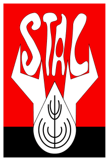
The flag is interesting, vexillologically-speaking: it’s basically the logo with a white border all around, but the logo is horizontally divided, the top 4/5ths red and the bottom fifth black, with a symbol over all. The symbol consists of a drop-shaped element with some further elements inside, designed to symbolize a spike, plus two hand-shaped elements, which hold the sigla of the union in some strange irregular font.
Everything in the symbol stands for something, very in the spirit of the time it was created: 1975. According to the union’s website at http://www.stal.pt/ the drop stands for the sweat of labour, the spike stands for the bread conquered by work, the red background stands for the path towards a socialist, classless society, emerging from the blackness of our fascist past.
The spike is yellow in the symbol and in all references to it one can find in the website. However, in the flags I’ve seen, it is always black, probably as a way to increase contrast and make it visible.
Jorge Candeias, 31 Aug 2003